top of page
Magazine Design
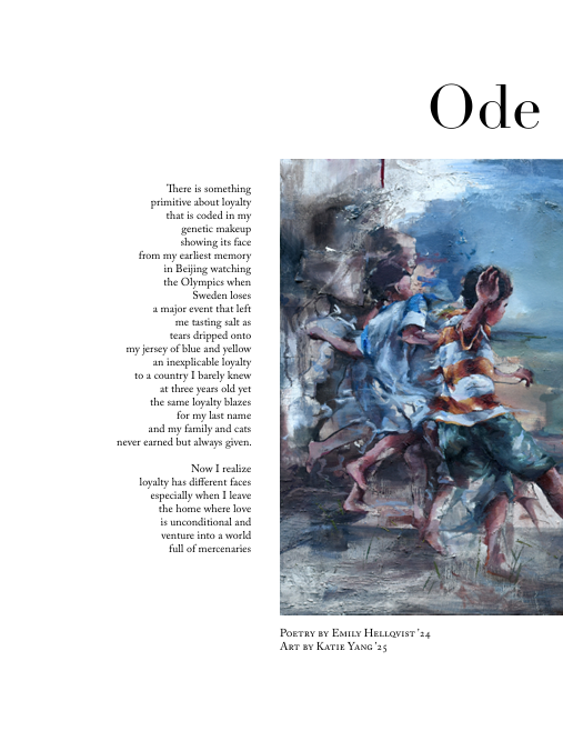
The "ink." magazines project an image of literary sophistication and artistic sensibility through their consistent design choices. The layout conveys a serious and thoughtful approach to content.
We use a refined serif typeface for both titles and body text consistently across all issues establishes a strong, cohesive brand identity. Titles are given appropriate visual weight, creating a clear hierarchy for content.
Many of the poems, especially those with shorter lines or distinct stanzas, benefit from ample white space. This allows the poetry to "breathe" on the page, enhancing readability and visual appeal.


bottom of page